

How Web UI is Organized
The Flexus web interface is designed for efficiency and ease of use. This guide will help you understand every aspect of the UI and how to customize it for your workflow.
Main Layout Overview
The Flexus interface is broken down into five main areas, as highlighted in the screenshot below:
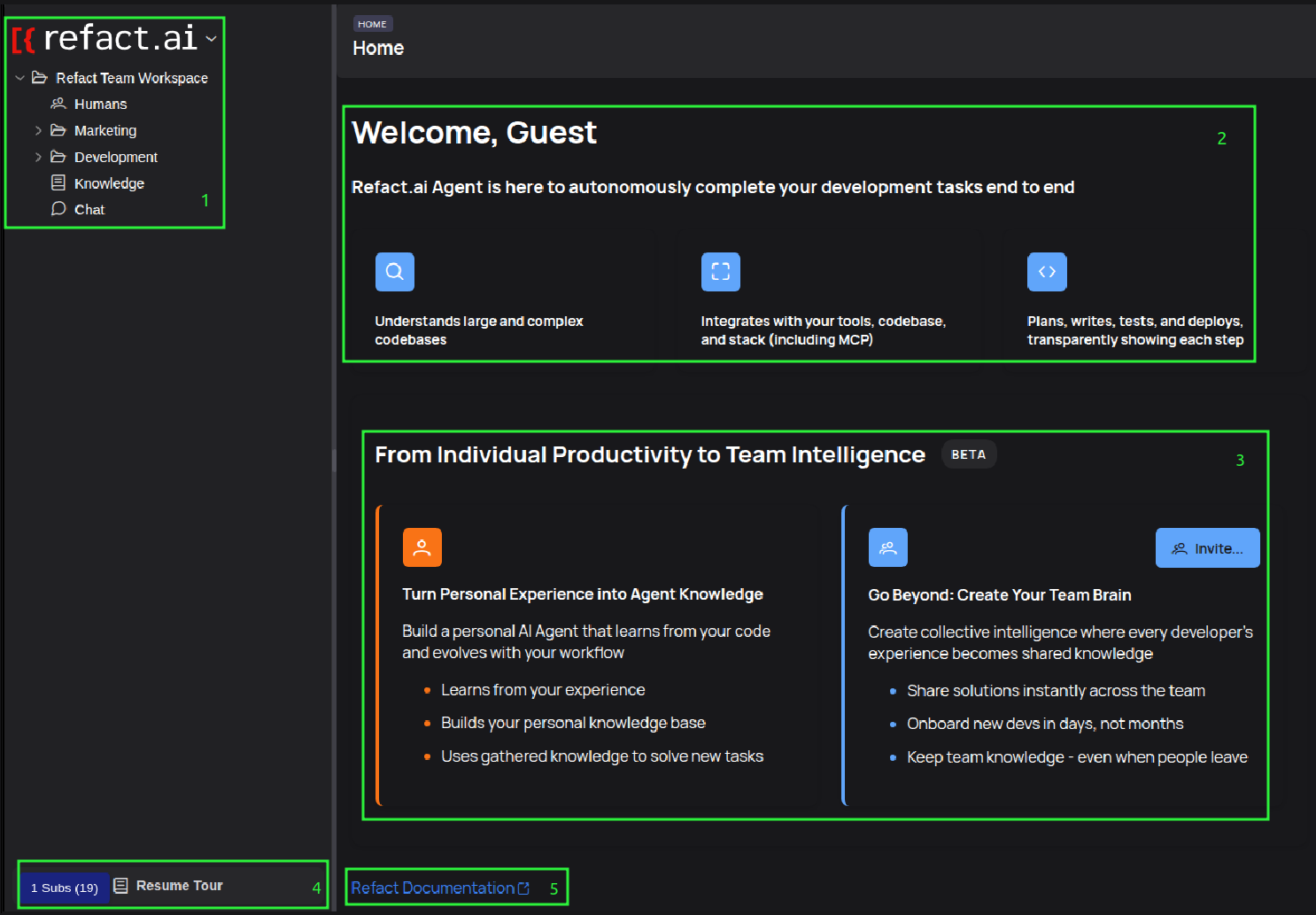 The main dashboard is divided into five distinct functional areas.
1. Navigation Sidebar (Left)
- Primary Navigation: Provides access to all your main workspace sections like
Humans,Bots,Marketing,Development,Knowledge, andChat.
2. Welcome & Status Area (Center Top)
- Welcome Message: Greets the user and provides a brief introduction to the Refact.ai Agent.
- Core Capabilities: Highlights the three main functions of the agent.
3. Core Features Area (Center Bottom)
- From Individual to Team: This section focuses on the key value propositions: building a personal AI from your experience and creating a shared team brain.
- Invite Button: A clear call-to-action to invite team members.
4. Sidebar Footer
- Status Information: Shows important details like subscription status (
Subs) and a link toResume Tour.
5. Documentation Link
- Quick Access to Help: A convenient link to the official Refact Documentation.
Key Interface Components
The Flexus interface is composed of several key components that help you navigate and manage your workspace.
The Navigation Sidebar
The sidebar on the left provides a hierarchical tree view of your entire workspace.
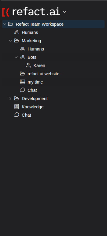 The sidebar allows you to expand and collapse groups to navigate through your projects, teams, and knowledge bases.
- Workspace Root: The top-level item shows the name of your current workspace.
- Hierarchical Structure: Click the arrows to expand or collapse nested items like
Marketing,Humans, andBots. - Direct Access: Click on any item (e.g.,
Knowledge,Chat) to open it in the Main Content Area.
The User Menu
Clicking on the workspace name and logo at the very top-left of the screen opens the main User Menu.
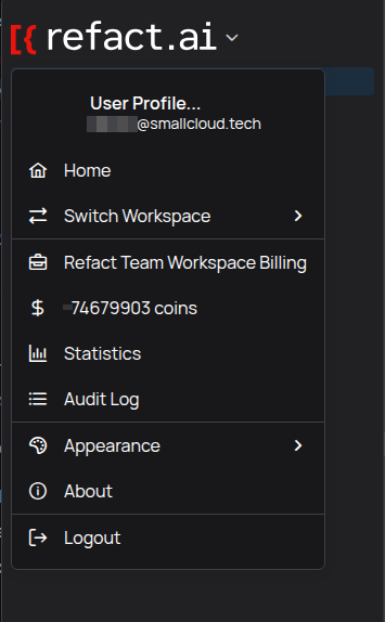 The User Menu gives you access to high-level account and workspace settings.
This menu contains important links for managing your account and workspace:
- User Profile…: Manage your personal account settings.
- Home: Return to the main dashboard view.
- Switch Workspace: If you belong to multiple workspaces, you can switch between them here.
- Billing: Manage your subscription and payment details.
- Statistics: View usage statistics for your workspace.
- Audit Log: See a log of important events and changes within the workspace.
- Appearance: Customize the look and feel of the interface.
- About: View version information about the application.
- Logout: Sign out of your account.
The Main Content Header
When you select an item in the sidebar, the Main Content Area updates to show its contents, along with a contextual header bar.
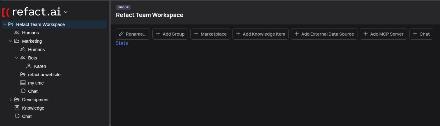 This header provides actions relevant to the selected item, in this case, the ‘Refact Team Workspace’.
This bar contains key actions for the selected item. For a group or workspace, this typically includes:
- Rename…: Change the name of the selected item.
- Add Group: Create a new subgroup within the selected group.
- Marketplace: Access the marketplace for extensions and bots.
- Add Knowledge Item: Add a new knowledge base.
- Add External Data Source: Connect an external data source.
- Add MCP Server: Connect a Model-as-a-Service provider.
- Chat: Open the chat associated with the item.
Member and Role Management
When you select a group or workspace and navigate to the “Humans” or user management section, you will see a list of all users with access. From here, you can manage their roles and permissions.
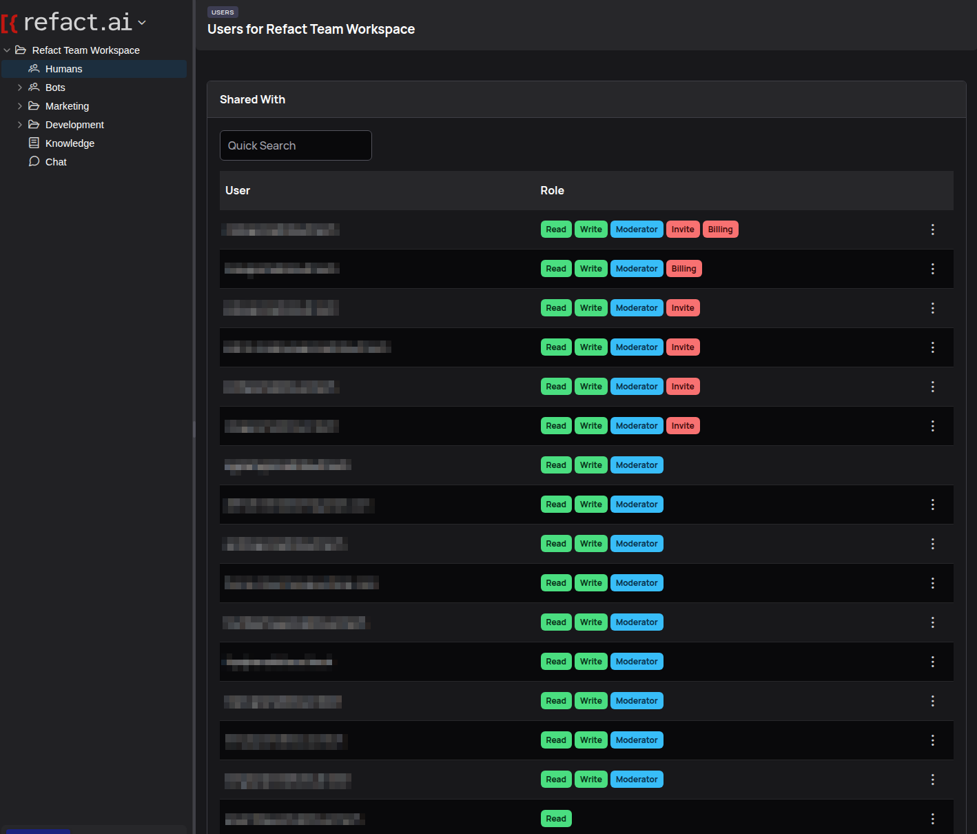 The user management screen displays a list of users and their assigned roles. Clicking on a user’s role opens a context menu to change their permissions.
- User List: Shows all users who have access to the selected resource.
- Role Management: Clicking on a user’s current role opens a dropdown menu with available roles.
- Available Roles: You can assign roles such as
Read Only,Read/Write,Moderator, orModerator + Can Invite Outside Collaborators. - Revoke Access: The menu also includes an option to
Revokea user’s access entirely. - Quick Search: You can filter the list to quickly find a specific user.
Interactive Elements and Context Menus
Context-Sensitive Actions
Right-clicking on almost any item in the sidebar will open a context menu with actions relevant to that specific item. This is the primary way to interact with your workspace content.
Notice how the menu changes depending on what you select.
Example 1: Context Menu for a Group
When you right-click on a group like “Marketing”, you get general management options.
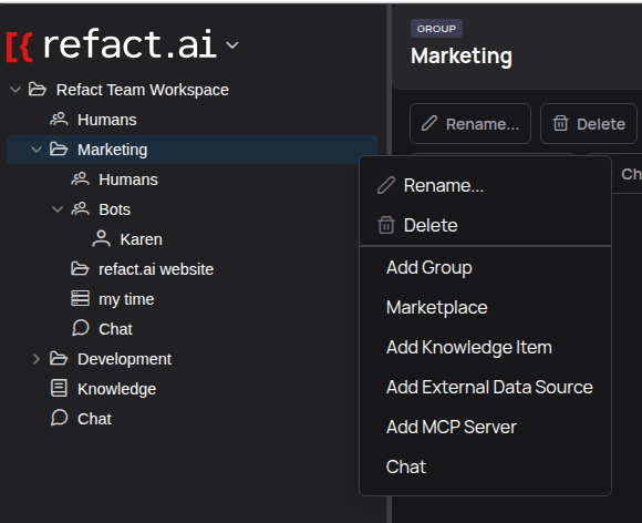 Options for a group include adding more subgroups, managing knowledge, and deleting the group.
Example 2: Context Menu for a Persona
However, if you right-click on a Persona (a configurable bot) like “Karen”, the options are completely different and specific to managing it.
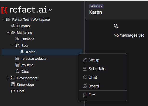 Options for a Persona are highly specialized, such as Setup, Schedule, and Fire.
This powerful feature means you always have the right tools at your fingertips, exactly where you need them.
Hover Interactions
- Tooltips with detailed information may appear when you hover over certain elements.
Interactive Sidebar Features
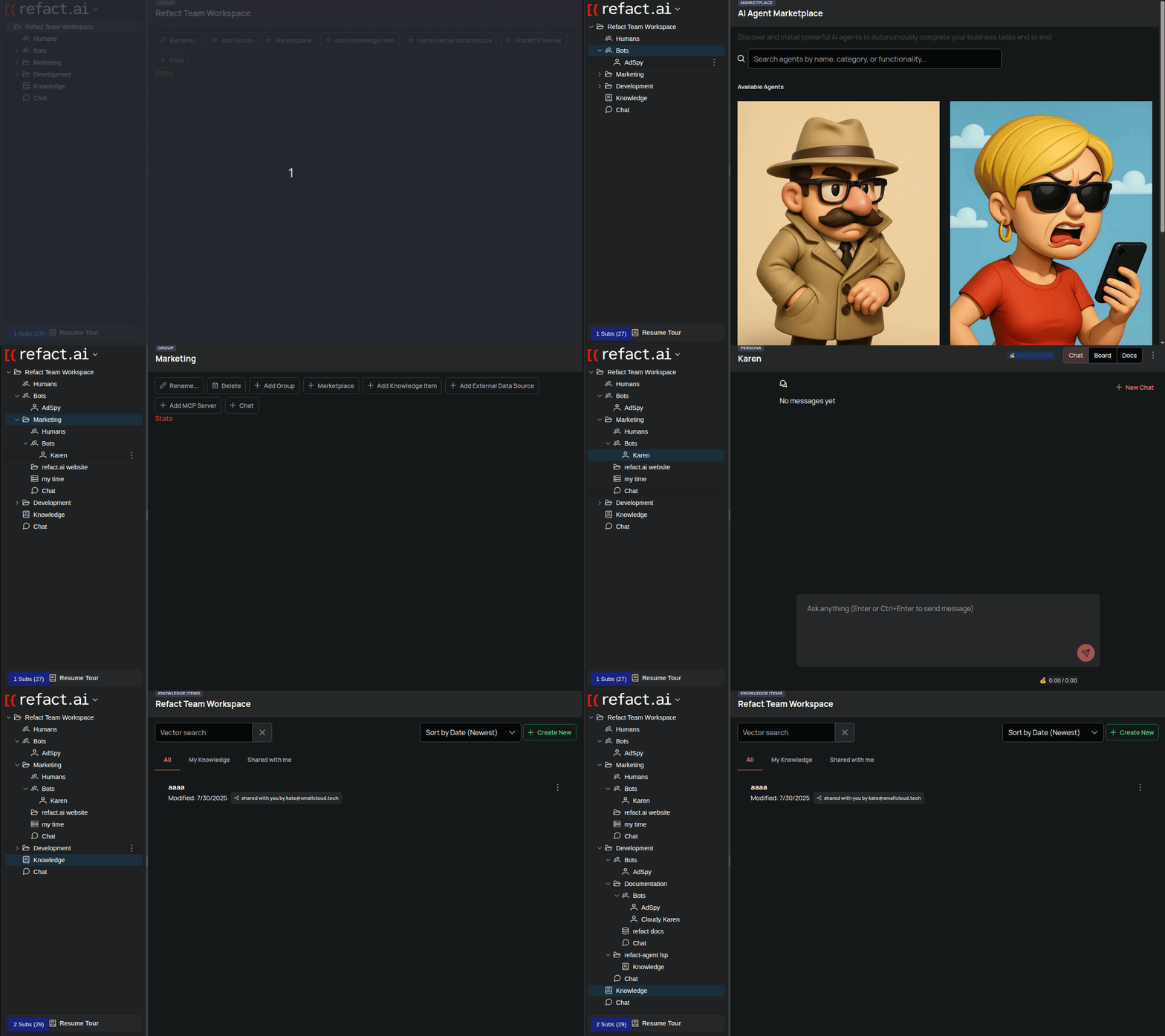 Animated demonstration of group expansion and navigation
Expandable Groups
- Click the arrow next to a group name to expand or collapse it, showing the nested items inside.
Tree Navigation
- Intuitive hierarchical structure: The sidebar uses indentation to clearly show how items are nested within each other.
- Contextual Headers: The header in the main content area updates to show the title of the item you’ve selected in the tree, helping you stay oriented.
Theme and Appearance
You can customize the appearance of the Flexus interface to your liking.
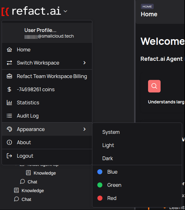 The Appearance submenu in the User Menu allows you to change the theme and accent color.
- Click on the workspace name at the top-left to open the User Menu.
- Hover over Appearance to open the submenu.
- Theme: Choose between
System(matches your OS setting),Light, orDarkmode. - Accent Color: Select one of the accent colors (Blue, Green, or Red) to personalize highlights and buttons throughout the interface.
Advanced Features
Multi-workspace Support
If you are a member of multiple workspaces, you can easily switch between them.
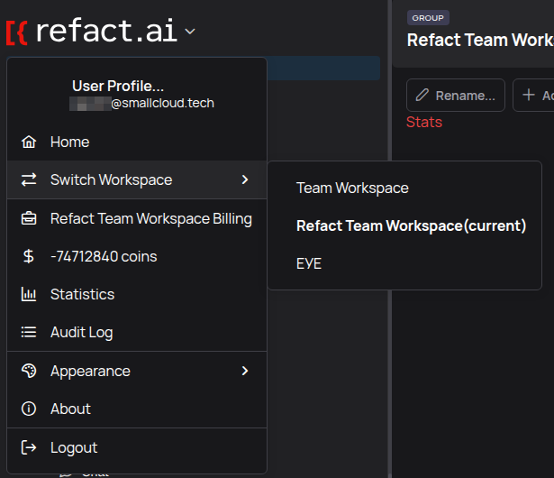 The ‘Switch Workspace’ option in the User Menu opens a list of your available workspaces.
- Open the User Menu by clicking the workspace name at the top-left.
- Hover over Switch Workspace.
- A submenu will appear listing all workspaces you have access to. The one you are currently in is marked as
(current). - Click on the name of the workspace you wish to switch to.
The Flexus web interface is designed to be powerful yet intuitive. Now that you are familiar with the main components, you can confidently navigate your workspace and manage your projects.
Next Steps: